Visual Design | Front Row Salon

Badass salon owner Kat Nacario (front center), with her salon crew.
Front Row Salon (fROW, for short) is a curated salon experience in Petaluma, CA. FROW, informally, is the front row in a concert—the most desirable place in the audience.
Kat Nacario is an amazing hair stylist, but she’s more than that—she’s been one of my best friends for more than 25 years.
A few months after the pandemic/world shutdown began, Kat’s dream of salon ownership was coming to fruition. Her vision was clear—she wanted to create a welcoming space for people to feel like rockstars. Front Row Salon isn’t quite music-themed (no Hard-Rock vibes here), it’s more than that. Front Row Salon encapsulates the confidence, glamour, and bad-assery that live shows (something I think most of us can agree we’re greatly missing at the moment).
When Kat came to me asking for help with branding and marketing materials I was thrilled. Not only was my dear friend embarking on a huge next step—but she had clear and concrete ideas about her aesthetic, but also trusted me to take care of the details.
fROW’s aesthetic is clean, but punk rock. It has a constant nod to music without being gaudy. One wall of the salon is painted a rich black, with framed guitar picks and band photos adorning the wall in a burst of energy.
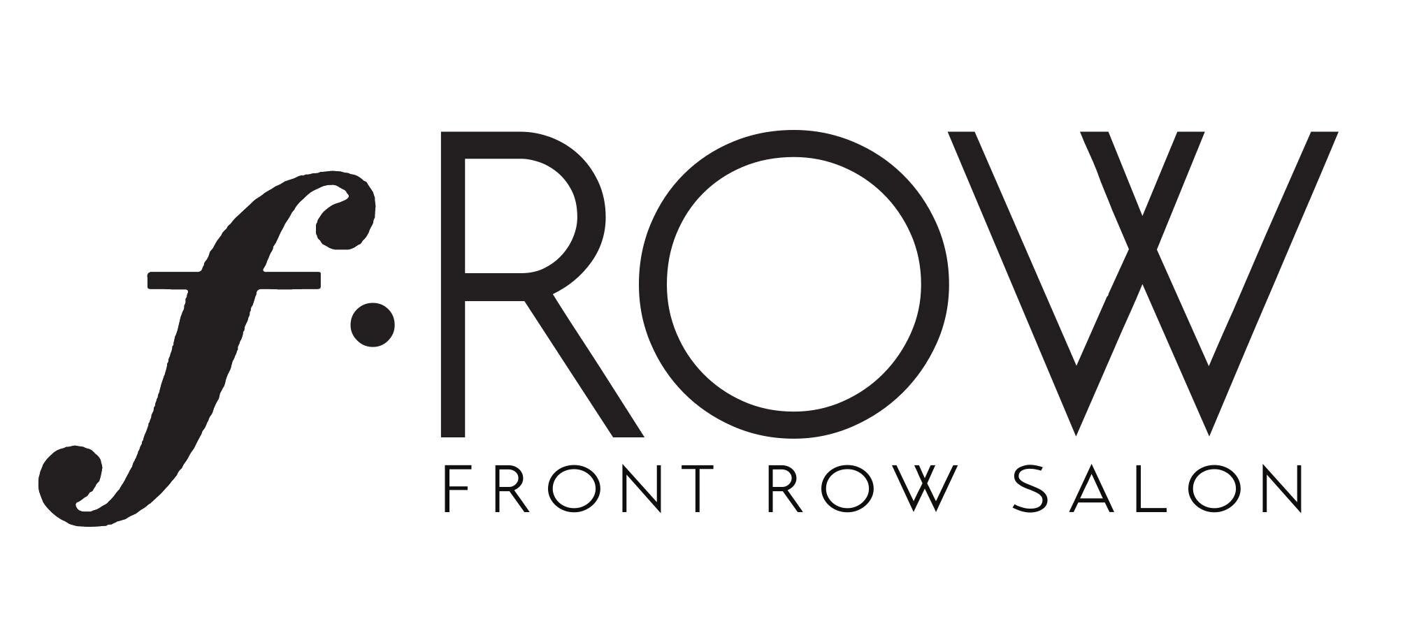
For the logo, Kat knew she wanted a musical forte symbol to create the “f” in fROW, and that she wanted a clean black logo. To accent the black and white, Kat was drawn to jewel tones, but didn’t have a particular tone in mind.
I created a couple of very simple branding examples for fROW, focusing on clean sans serif fonts with smooth lines. Along with the branding I created some quick sketches of the fROW logo in Procreate, then refined the ideations in Illustrator.
Kat and I hopped on a zoom call and hashed out some design details for the logo. She loved the first rendition, shown above. After some tweaking, I refined it until I got the final version.
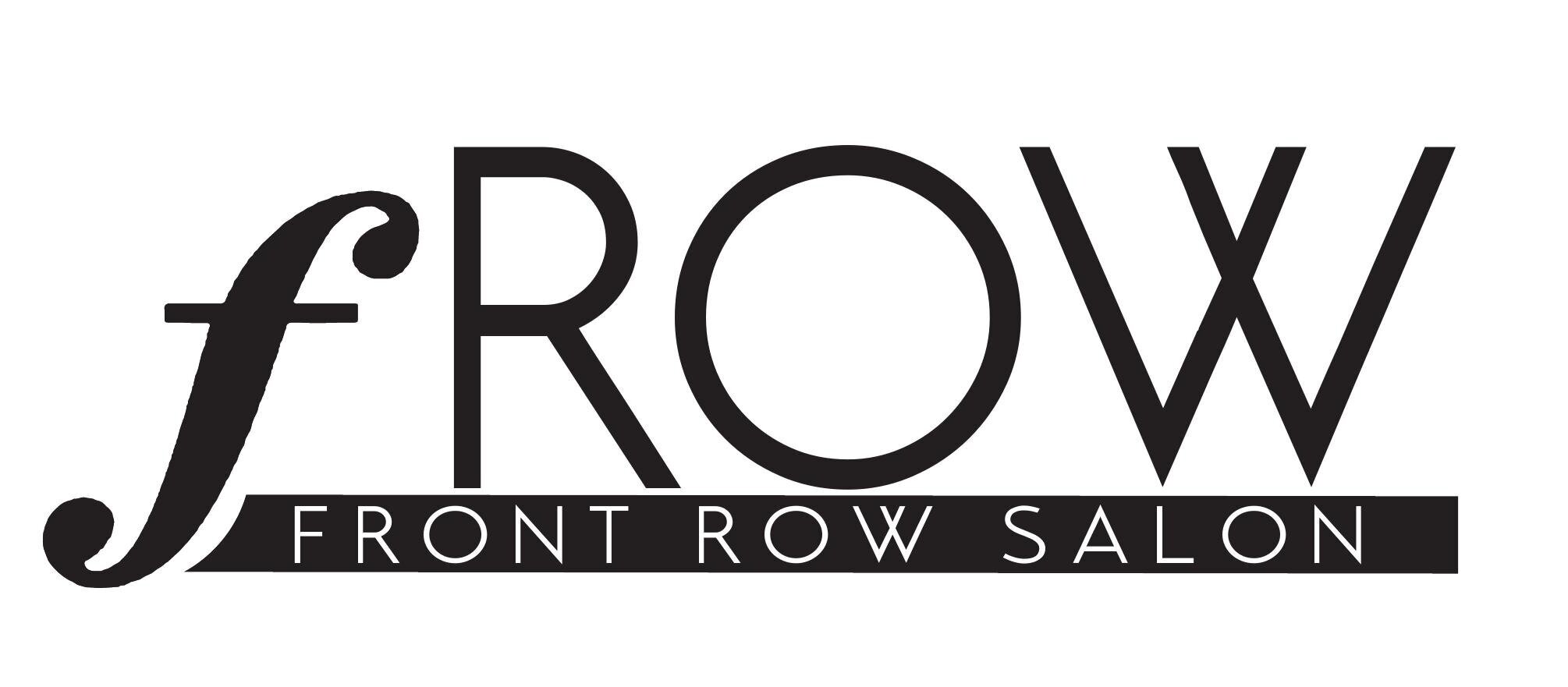
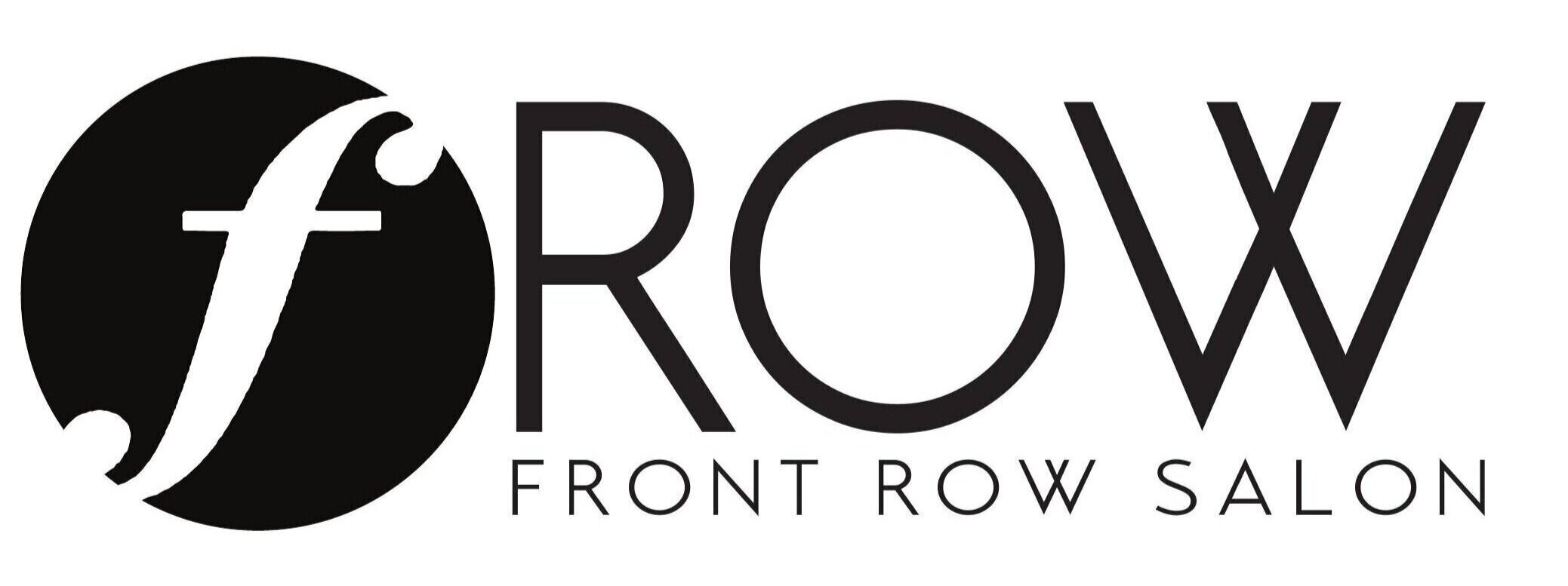
Initial mockups of the Front Row Salon Logo

The final Front Row Salon Logo
Once the logo was solidified, I worked with Kat on developing a website that met her vision. I used Squarespace, as the interface is something that I knew Kat would be able to use once the site was up and running. For design updates and major changes I’d be the point person, but for small updates I wanted Kat to feel empowered to make her own updates.
Kat provided me with all of the website text content, and before she had photos taken I used on-brand placeholders from Unsplash, in order to provide the look and feel of the salon.
The fROW website, because of the pandemic, has had to be updated to accommodate salon closures due to stay-at-home orders. Kat and her salon crew need to make money during the shutdown, so Kat was very quick to set up an e-commerce site through Square in order to bring in some revenue. The Shop section of the website was put in place quickly, to provide a quick and easy way for Kat’s clients to support the salon staff during this difficult time.

The fROW website

fROW marketing collateral